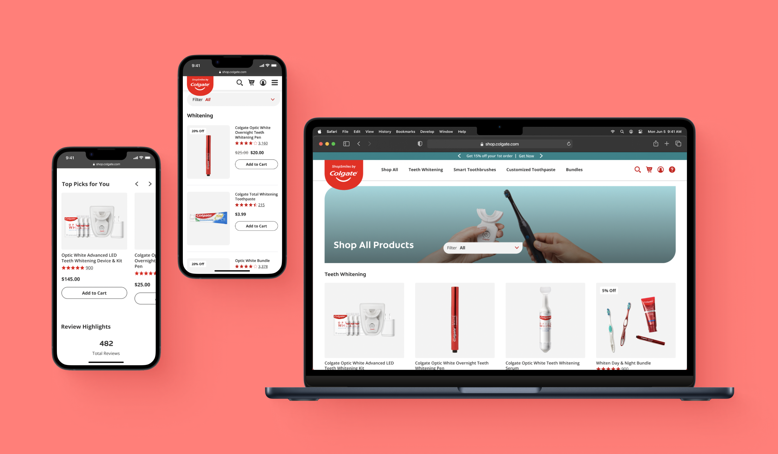
The most repeated component throughout ShopSmiles were product cards.
Although a single component, product cards touch upon most areas of the retail experience
and act as the main drivers of purchase decisions by providing a product's highest-level summary.
They allow shoppers to easily compare different products, which is a big user "want."
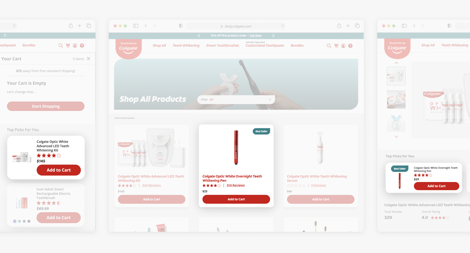
Above: Instances of the many, many product cards repeated throughout the site.
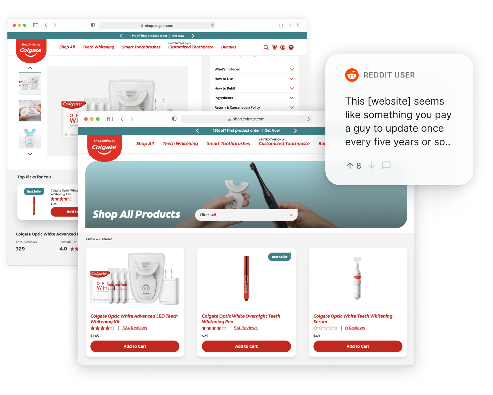
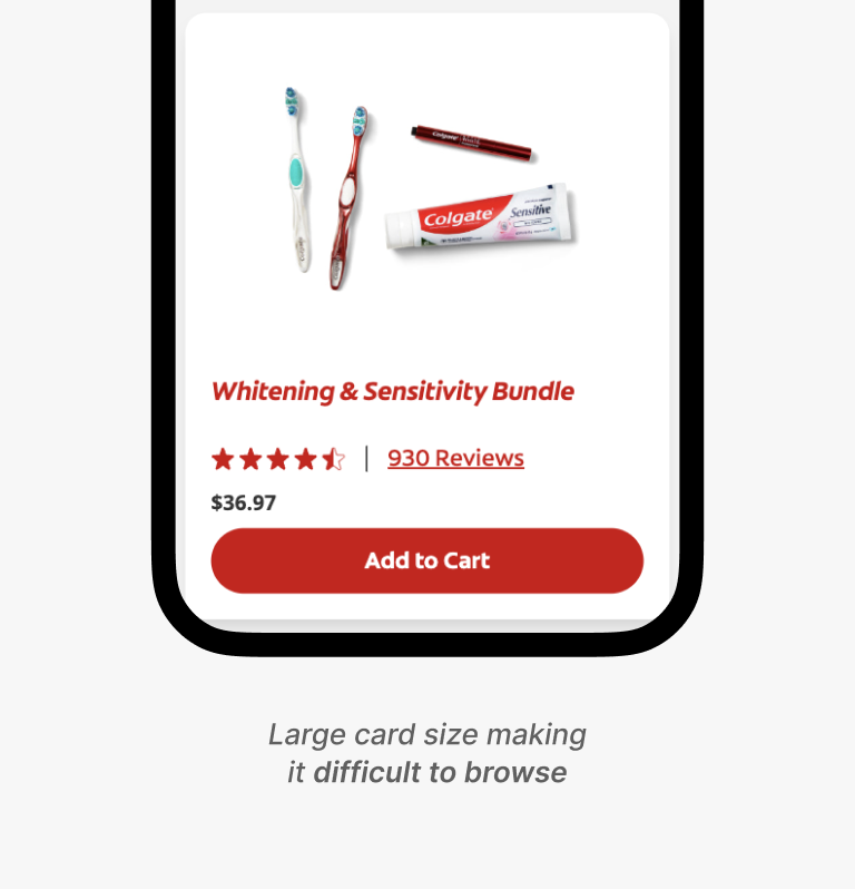
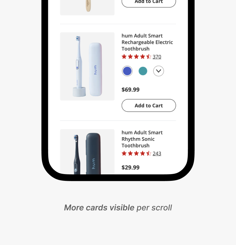
However, the current product cards had inaccessible & unintentional design choices.
Product cards are often a user's first impression of the product.
Yet, unfortunately, the cards weren't doing so hot with leaving great impressions...
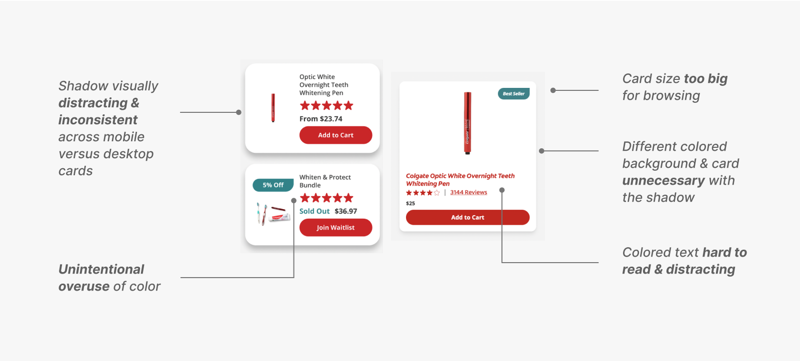
Above: Some poor design choices of the current product cards.
I also noted that there were too many variations of the cards throughout the site, making it:
- Inconsistent for users
- Inconvenient to develop
Thus—redesigning product cards—, the perfect opportunity for a low effort, high impact project.
With all of the above in mind, redesigning product cards provided the perfect opportunity for our scope,
where I could uplift not only the users', but also the engineers' experiences.
Card Breakdown
Before diving into designs, I first took time to understand what makes an ideal product card.
dictionary
A product card is a container (common region) of related information regarding a product, presenting information in a visually intuitive and digestible way.

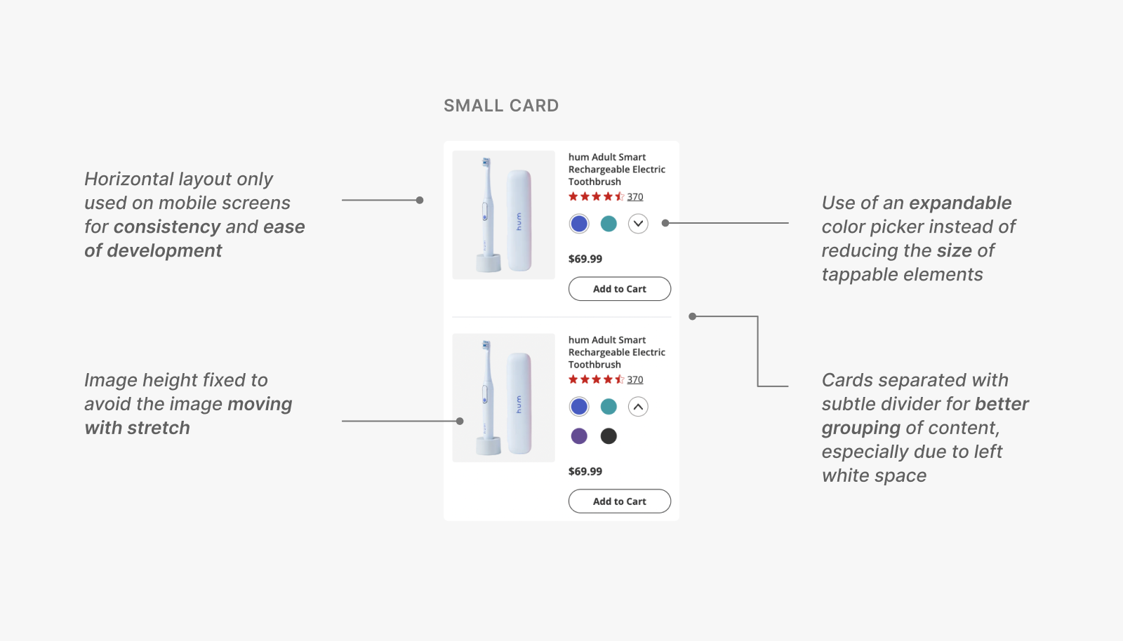
Product cards mainly utilize two layouts: vertical and horizontal. On the card,
users expect to see the product's name, image, price, ratings, and description,
with a call to action (CTA) commonly included by the business.
Our business team also required that we include secondary information,
or content that will not always be visible on the card, such as:
- Sale percentage
- Original & discounted price
- New/best seller labels
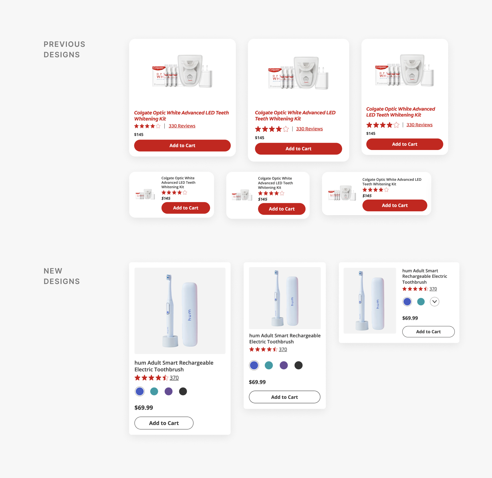
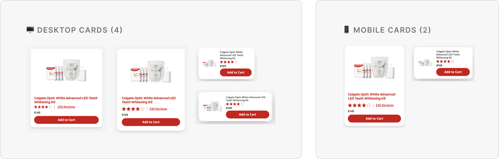
I then reduced the number of card variations for a consistent experience & easier development.
While 6 variations of the product card lived in the ShopSmiles design system,
many were redundant due to similar layouts with minor dimensional differences.
These cards were then immediately consolidated.
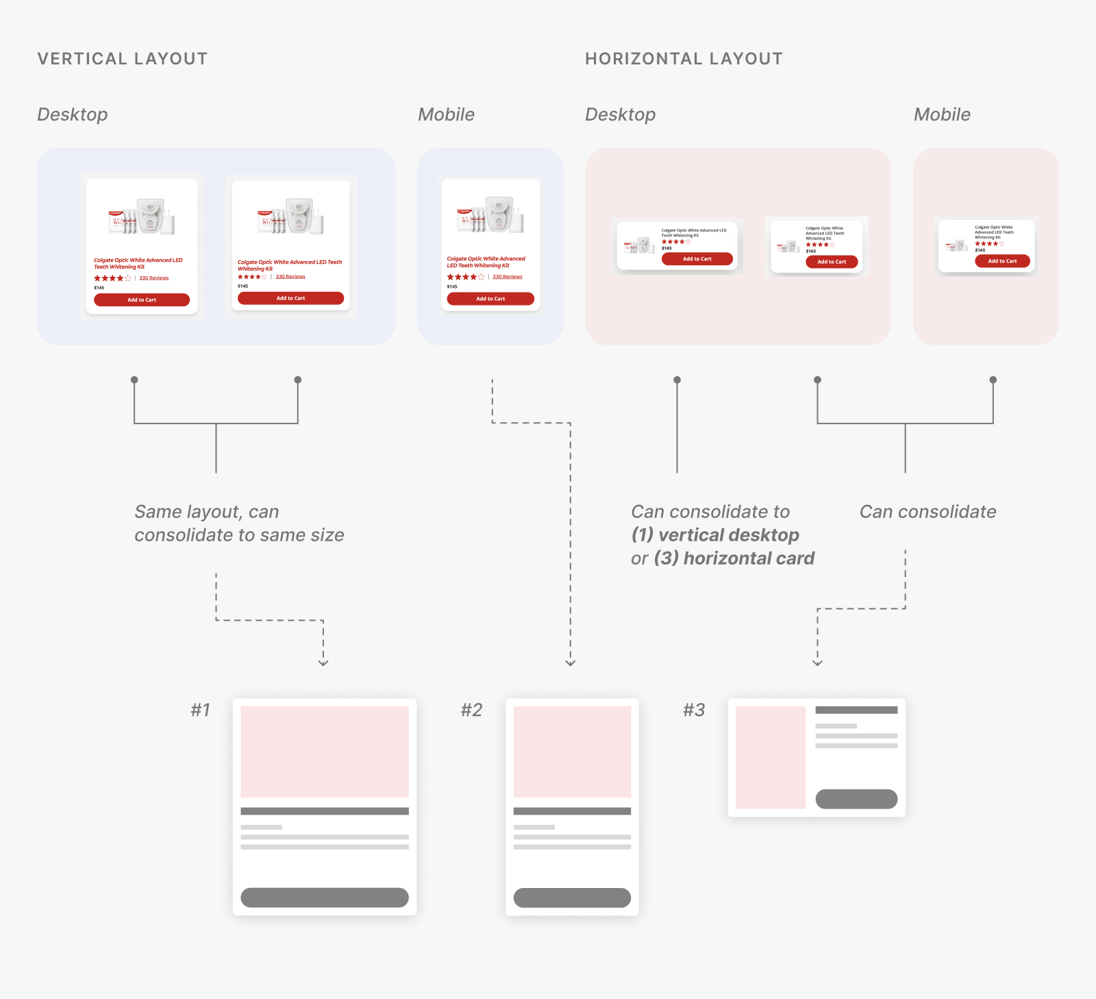
Instead of a slightly longer horizontal desktop card,
I noticed that we could either use (1) the vertical desktop or (3) the newly consolidated horizontal card,
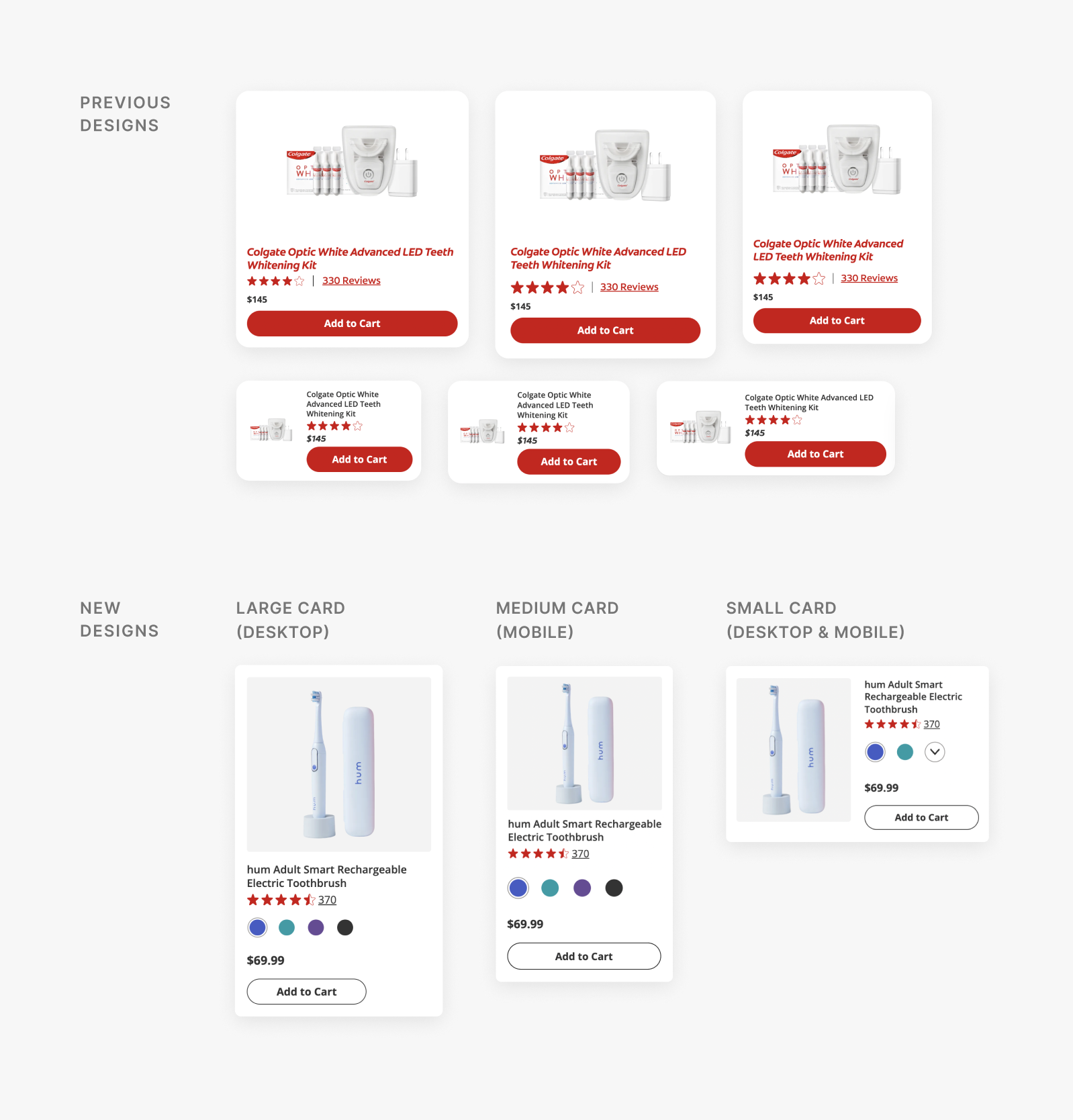
ultimately moving forward with 3 card variations for ShopSmiles:
- Large, vertical (Desktop)
- Medium, vertical (Mobile)
- Small, horizontal (Desktop & Mobile)
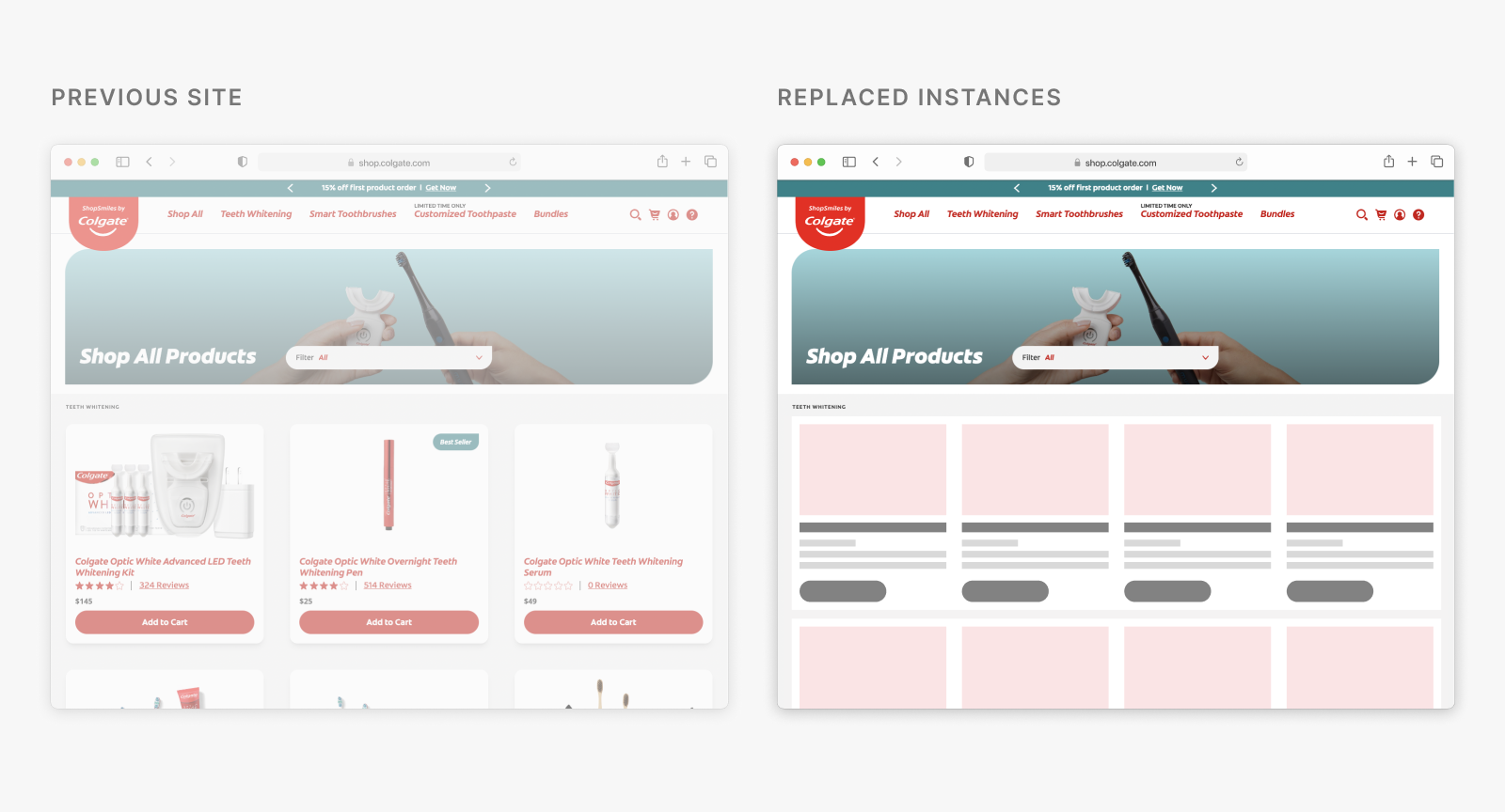
Most card instances were replaced with its new consolidated card,
with an exception to a few.
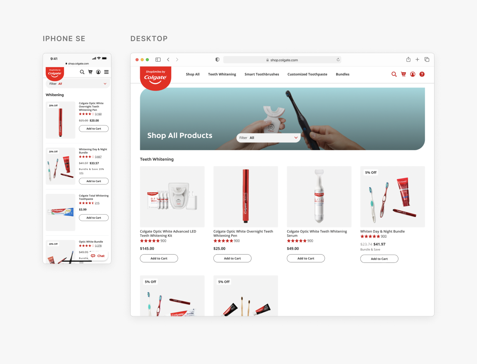
Right away, the new cards could replace instances of the ones it was most similar to before, like the Product Listing Page (PLP) below.
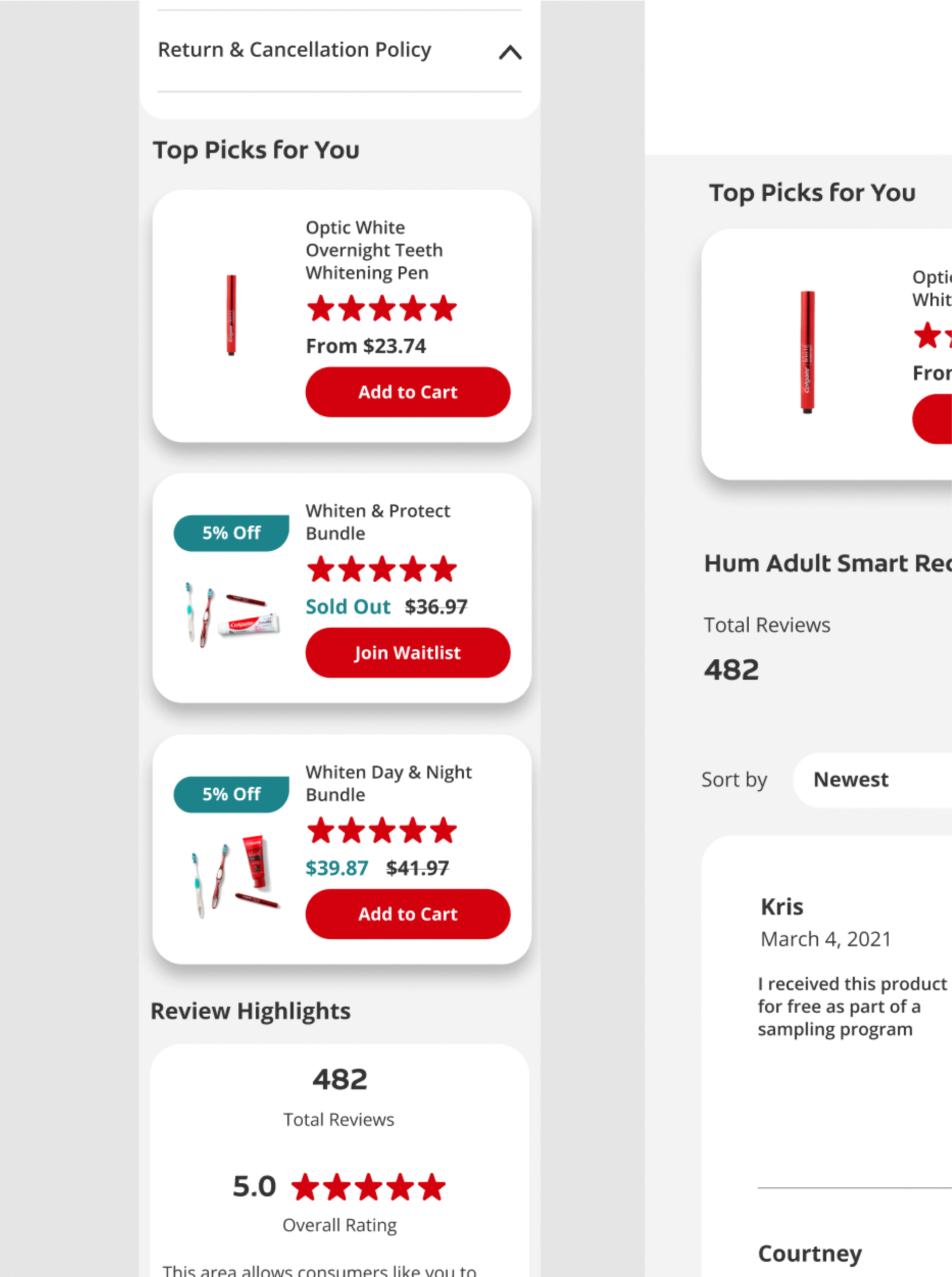
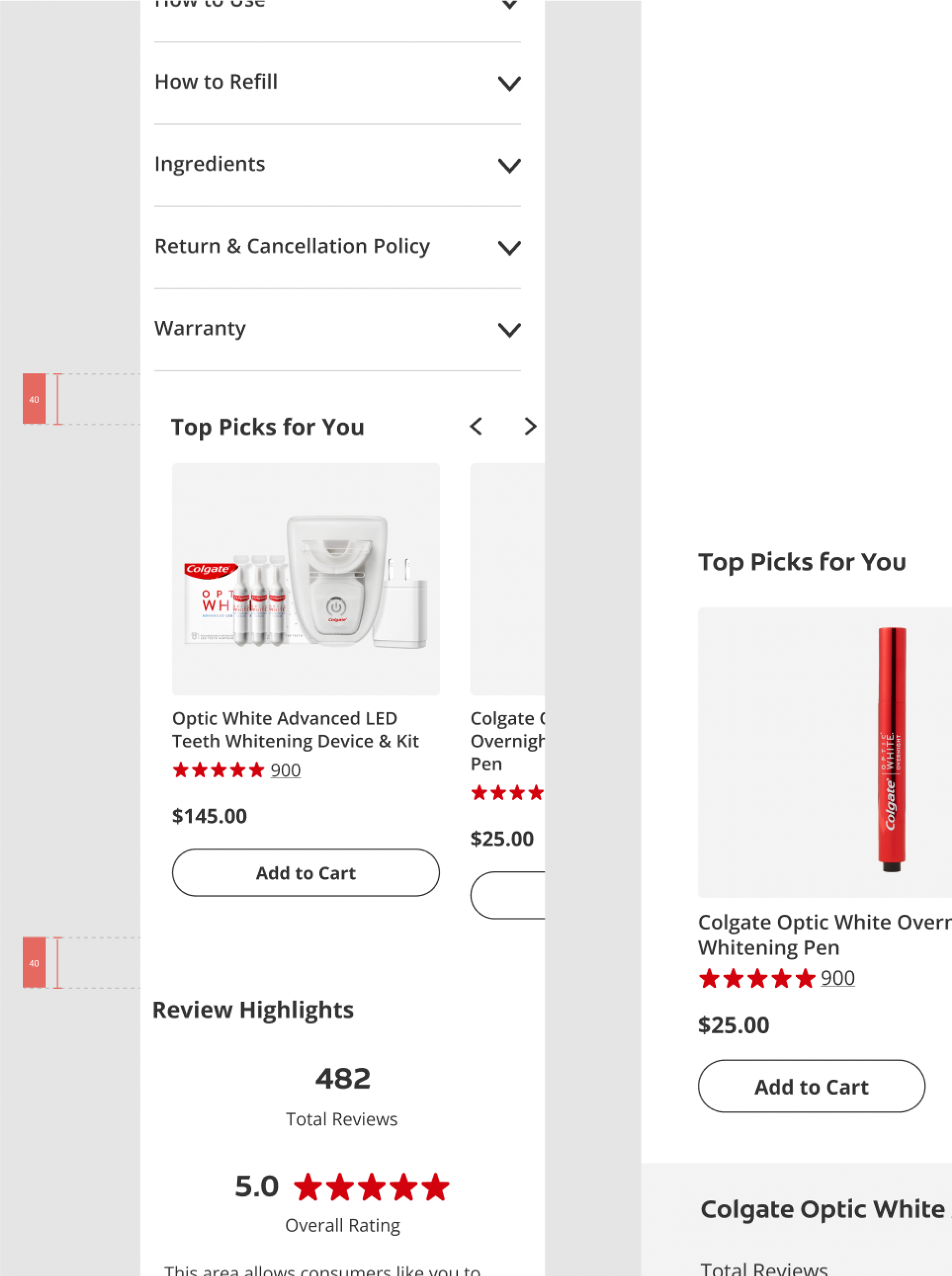
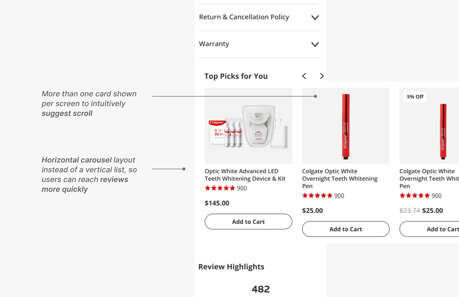
However, I also had areas of the site where a different card would be used. For instance, to reduce the time it takes for users to scroll and
reach the reviews, a big user want, I decided to place them in a carousel using the medium cards instead of a horizontal small card.
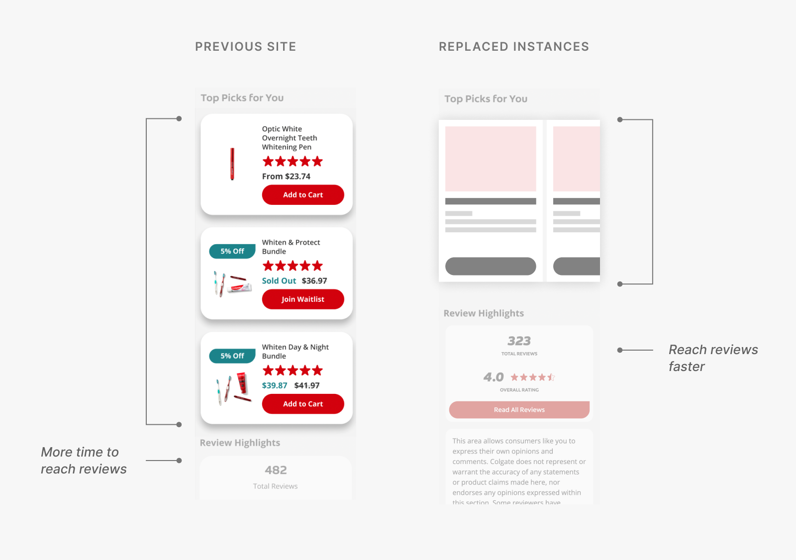
While this acknowledged one of the biggest users' wants, I also had to realize that
new restrictions would be introduced—such as having to minimize the number of complex haptic controls (i.e., nested scrolling, pop-up in a scroll).
Exploration
But wait... the business team came to us with a new request: a color picker.
Previous ShopSmiles' product cards did not show color options, as most of its products are offered in a single color.
However, the business team requested a color picker for the products offered in multiple colors, meaning
those offered in only one color would instead have to show:
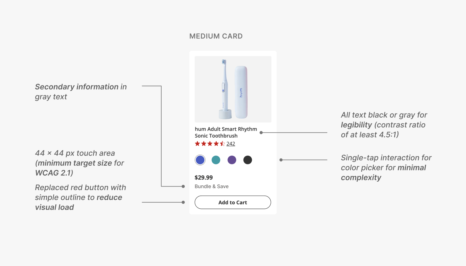
Once the card elements were finalized, I started iterating on
the medium-sized product card as it was both the intermediary size
and dealt with the most restrictions (as it's suited for mobile screens).
I would then adapt its design to the large and small-sized product card.
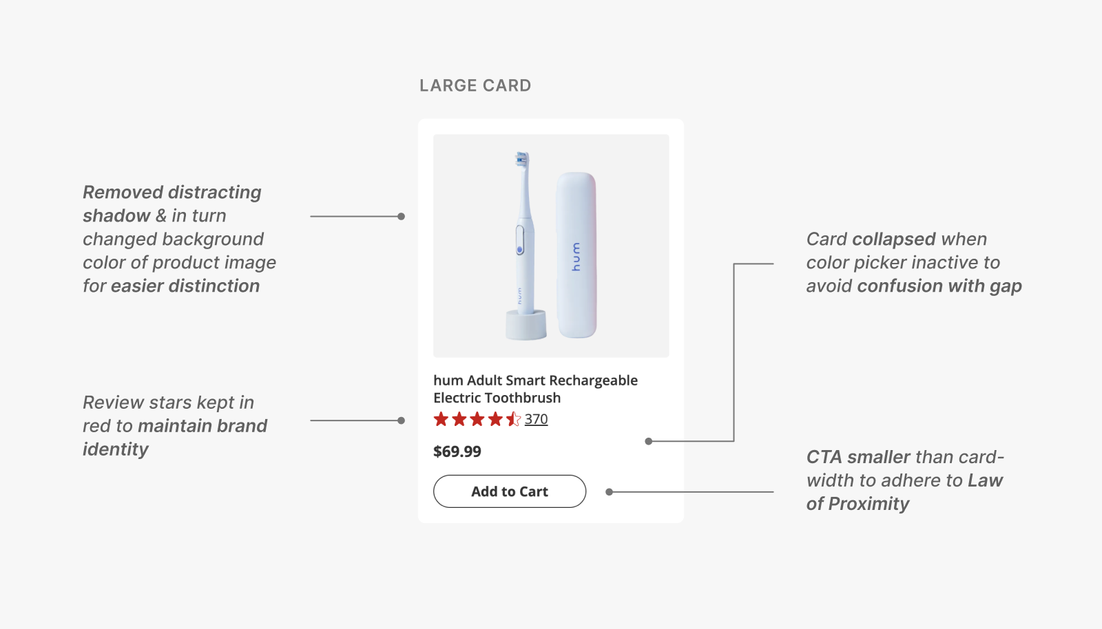
Iteration 1: Wide instead of narrow cards
Narrow cards allow for higher comparability (can view more products on a single screen), but hinders the tappability of elements, especially for those with small mobile screens.
Wide cards, on the other hand, might take up more space on the screen, but in turn offer greater accessibility and legibility—making it the ultimate winner.
emoji_objects
Accessibility triumphs all...
Here, we have the typical business vs. UX dilemma—showing more cards for more opportunities for sale versus the contrast to increase accessibility.
However, I learned that UX teams should always advocate for the user, even more so when accessibility is involved.
In fact, accessibility → more users have access → higher potential for sales, a double win!
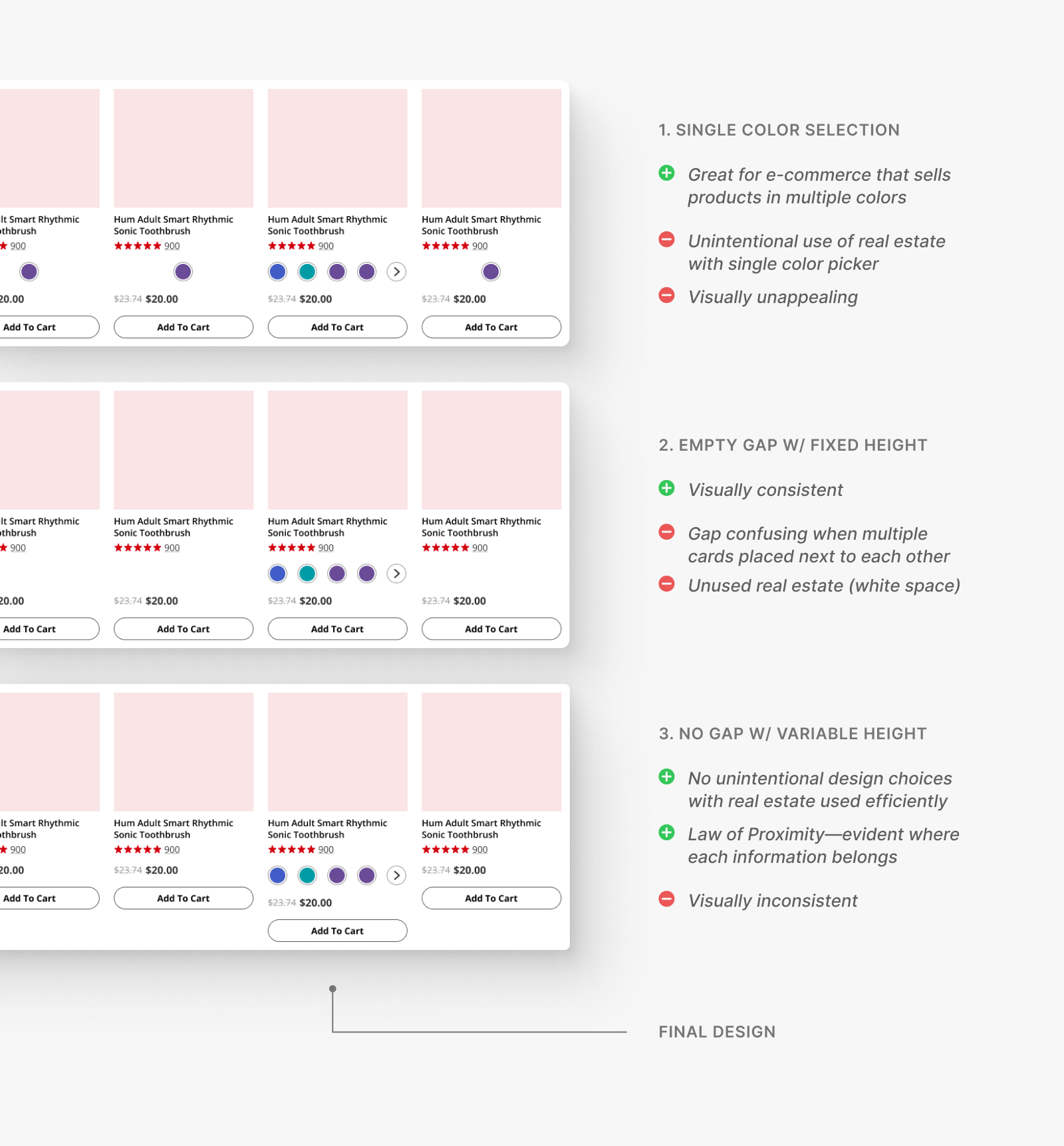
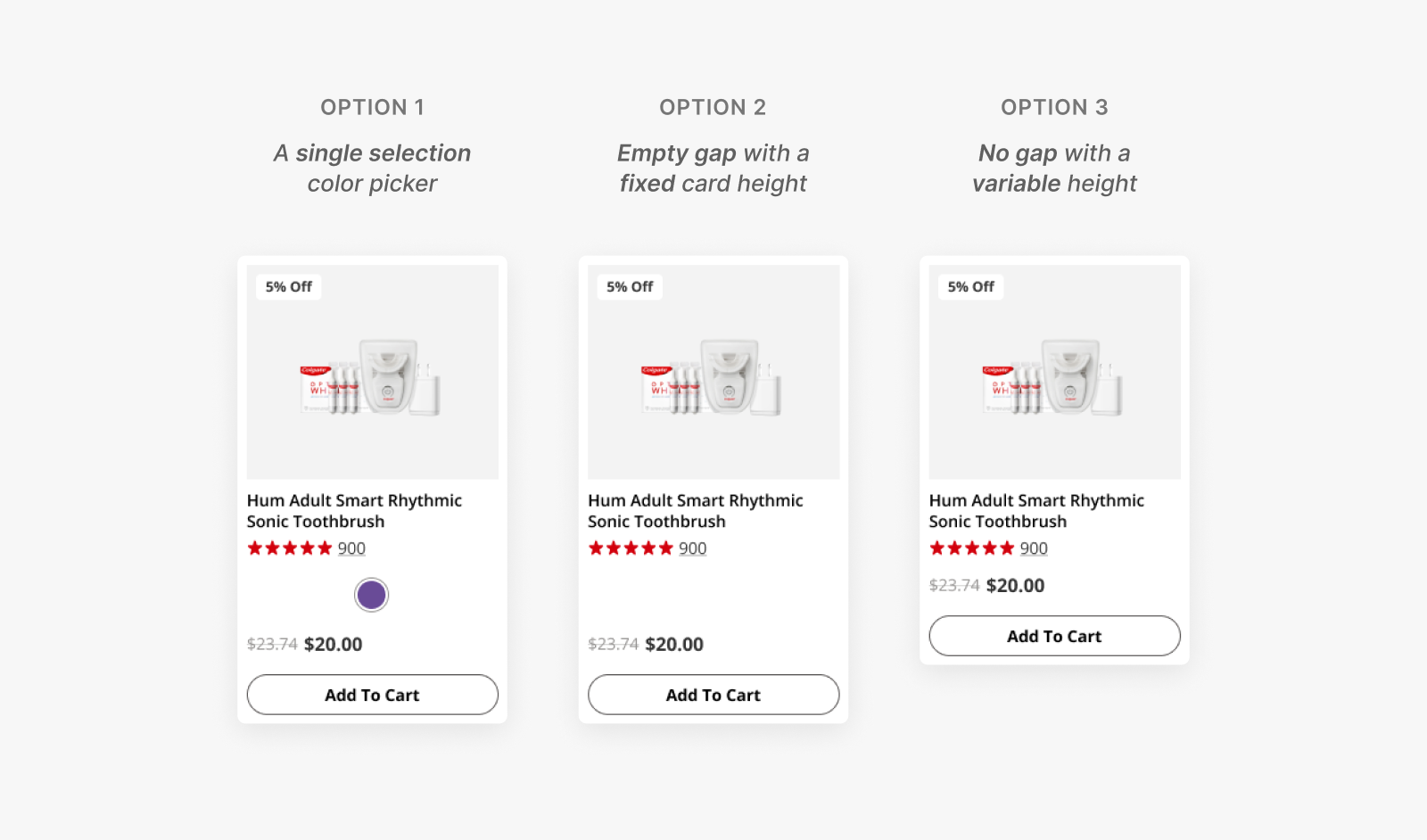
Iteration 2: An intuitive color picker
Due to the principles of proximity, the empty gap looked confusing when placed in a grid.
The single-option color picker, on the other hand, featured an unintentional design that took up real estate.
To avoid the possible confusion and make the most efficient use of space, I moved forward with the third option despite the variable height.
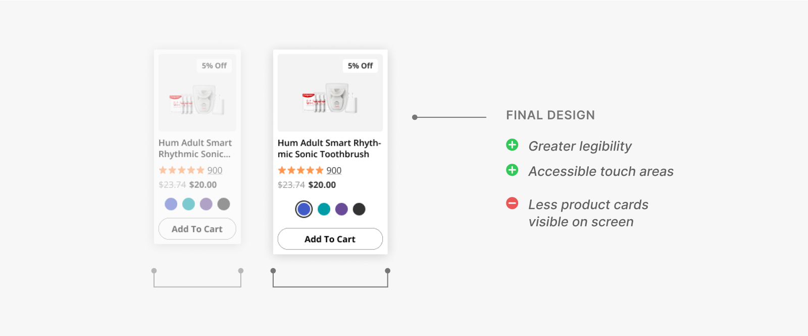
Iteration 3: An accessible color picker
However, as we still weren't satisfied with the problem of variable heights, I also came up with a fourth idea: nesting the color selections in a separate button that would prompt to an overlay.
This button would be always docked, solving the problems of an empty gap or misalignment.
While the idea gained support from the engineering team, we dismissed it as it was ultimately inaccessible, especially for those with screen readers.
The design would also:
- Be too complex if embedded within a mobile carousel
- Feel intrusive, causing frequent UX frustrations
emoji_objects
The more ideas, the better.
While my last idea turned out to be inaccessible, I still learned that the more ideas, the better.
By ruling out more and more ideas, not only is there a greater opportunity to justify the best-design-standing, but I can experiment and understand
more about the restrictions (here, I learned more about what was possible within the engineering restrictions).
Implementation
My team eventually fleshed out the entire design system with the new cards.
As previously mentioned, we were able to successfully reduce the component variation of product cards (base state without the color picker) from 6 to 3.

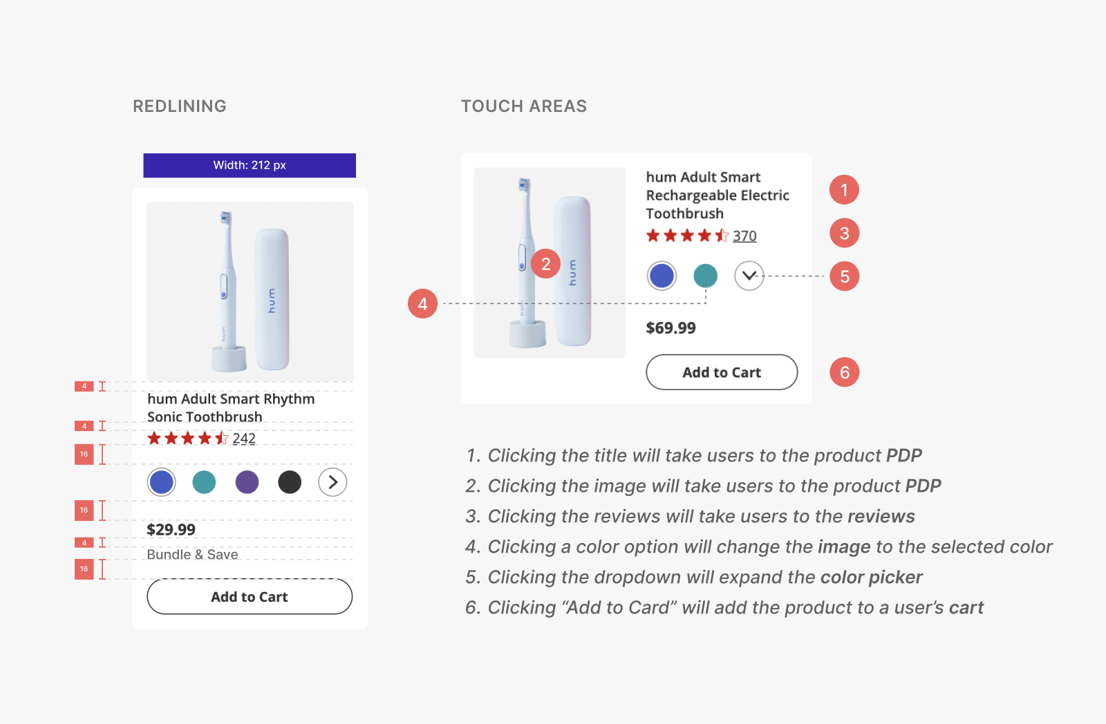
My mentor and I also documented and redlined the new cards, explicitly indicating its usage, spacing, touch areas, and more, for ShopSmiles' developers and any other involved.
Card documentation
My designs are currently live,
successfully kicking off ShopSmiles' UX overhaul.
Since its launch in January 2023, ShopSmiles' bounce rates decreased by ~20% while the
average number of pages visited per session increased by 0.5*.
This means that users are now spending more time browsing on ShopSmiles than before.
These numbers are anticipated to further improve as the remaining redesigns for ShopSmiles are rolled out.
I also participated in reimagining the information architecture of ShopSmiles' product description page (PDP)
through user research. Contact me for details if you want to learn more.
*As my internship concluded before I could observe the precise impact,
I sourced these figures from a third-party site.
Reflection & Takeaways
While at Colgate, I not only grew as a designer, but gained valuable work ethics & soft skills.
Hands down, my teammates at Colgate-Palmolive's UX team were one of the most supportive and enjoyable people to work with! Although my time at Colgate was short-lived, I learned so much not only about the design process but the cross-functional nature of UX design.
Some takeaways from my time at Colgate-Palmolive:
Good designers design for everyone.
As a company with a large user base, the UX team was especially concerned with the
accessibility of its products. A lot of effort was placed into making our designs accessible, whether it be designing for a screen reader or the smallest mobile screen size possible.
Organization & documentation is key.
Colgate-Palmolive is hundreds of years old, with numerous departments and roles. From this environment, I learned that it's ever-important to keep a record of everything you did and, most importantly, why you did them.
Good organization and documentation not only makes it easier to refer back to one's own work, but makes it easier for others as well—whether it be for hand-offs, working in cross-functional environments, or, simply, efficient communication.