Understand
First, I dissected our problem scope to understand it in greater depth.
GoodNotes is an iOS app designed for students to streamline their note-taking process. They challenged Berkeley Innovation to find a way to boost students' confidence levels while studying with the app.
As the Project Mentor, I led and guided four other designers to conceptualize GoodNotes Tags and Reminders, offering students a better way to organize and review their notes.
Timeline
January - May 2022
Tools
Figma
Google Suite
Team
4 Product Designers
2 Internal Stakeholders
(Senior Product Designer, Design Lead)
Skills
Mobile Tablet Design
Interaction Design
Apple HIG
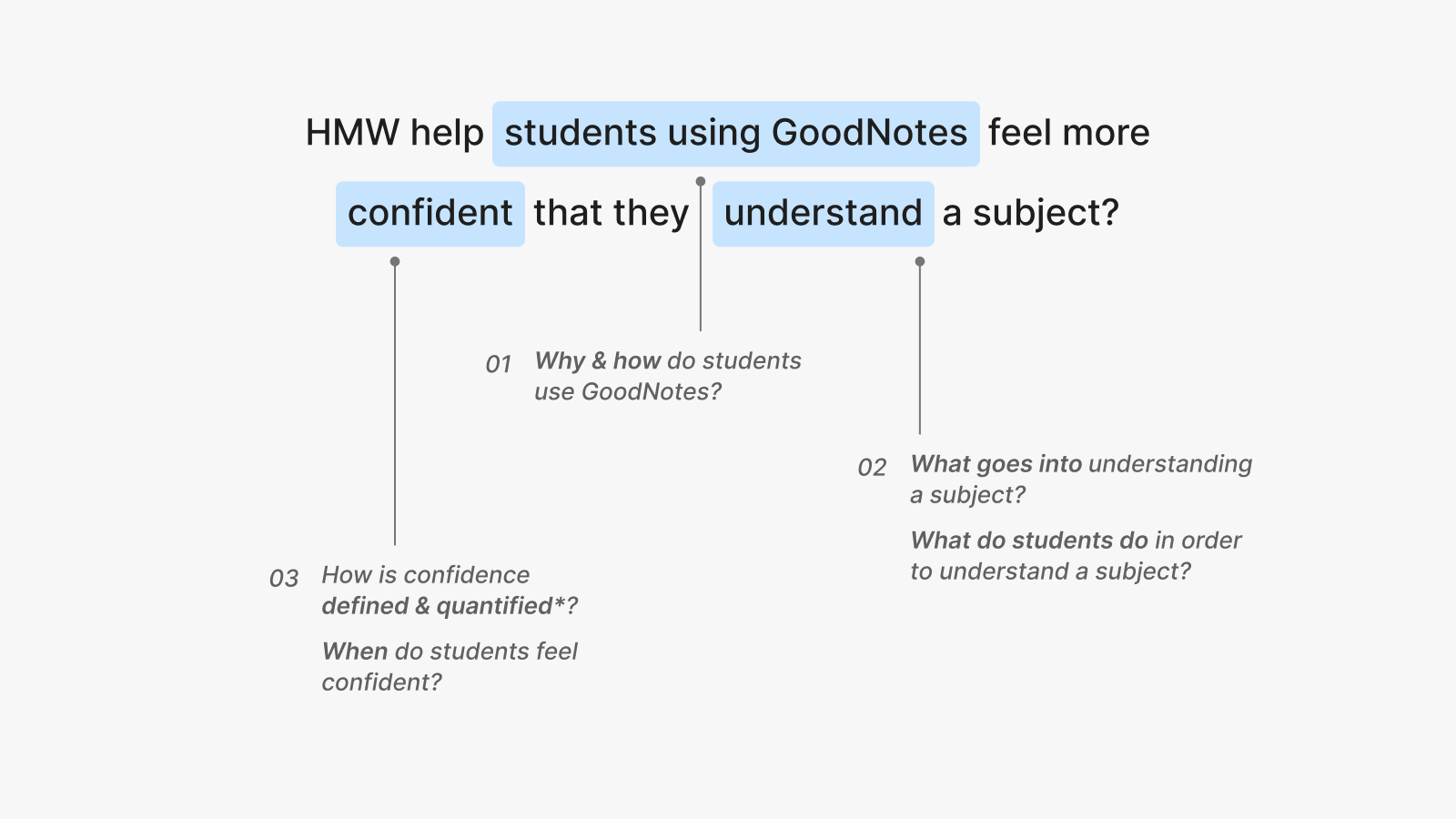
GoodNotes' mission is to empower people with knowledge through digital paper and innovations, whilst making studying efficient and enjoyable. Thus, GoodNotes bases their success on the success of its users—how well students understand their desired topic. With this in mind, the team approached us with the following question:
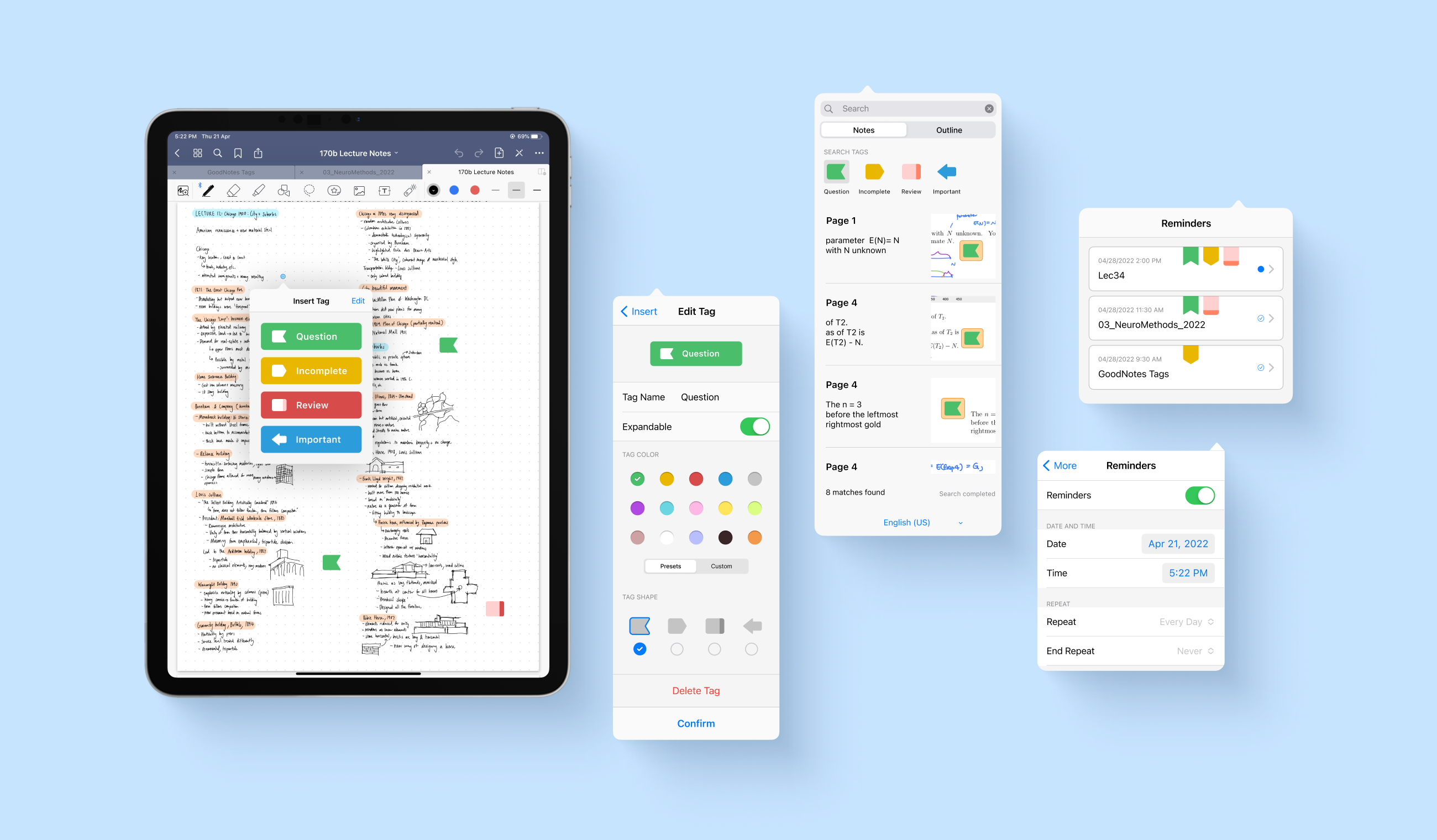
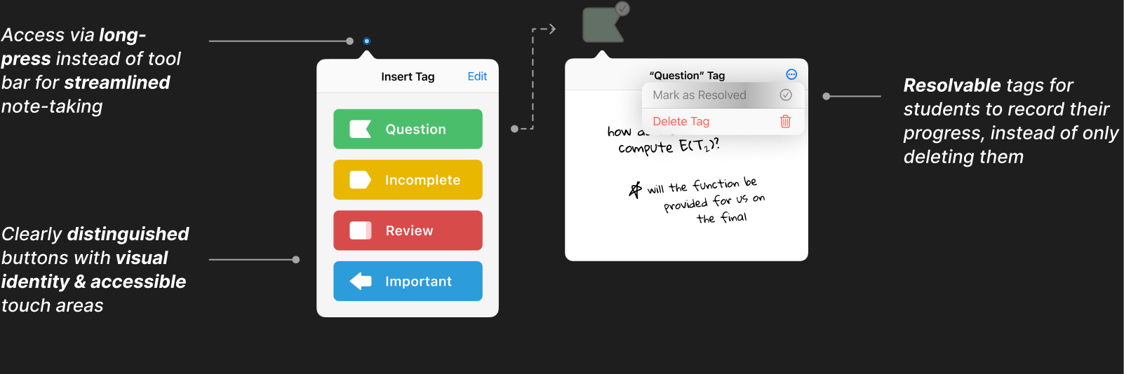
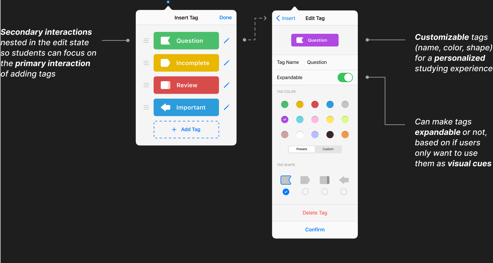
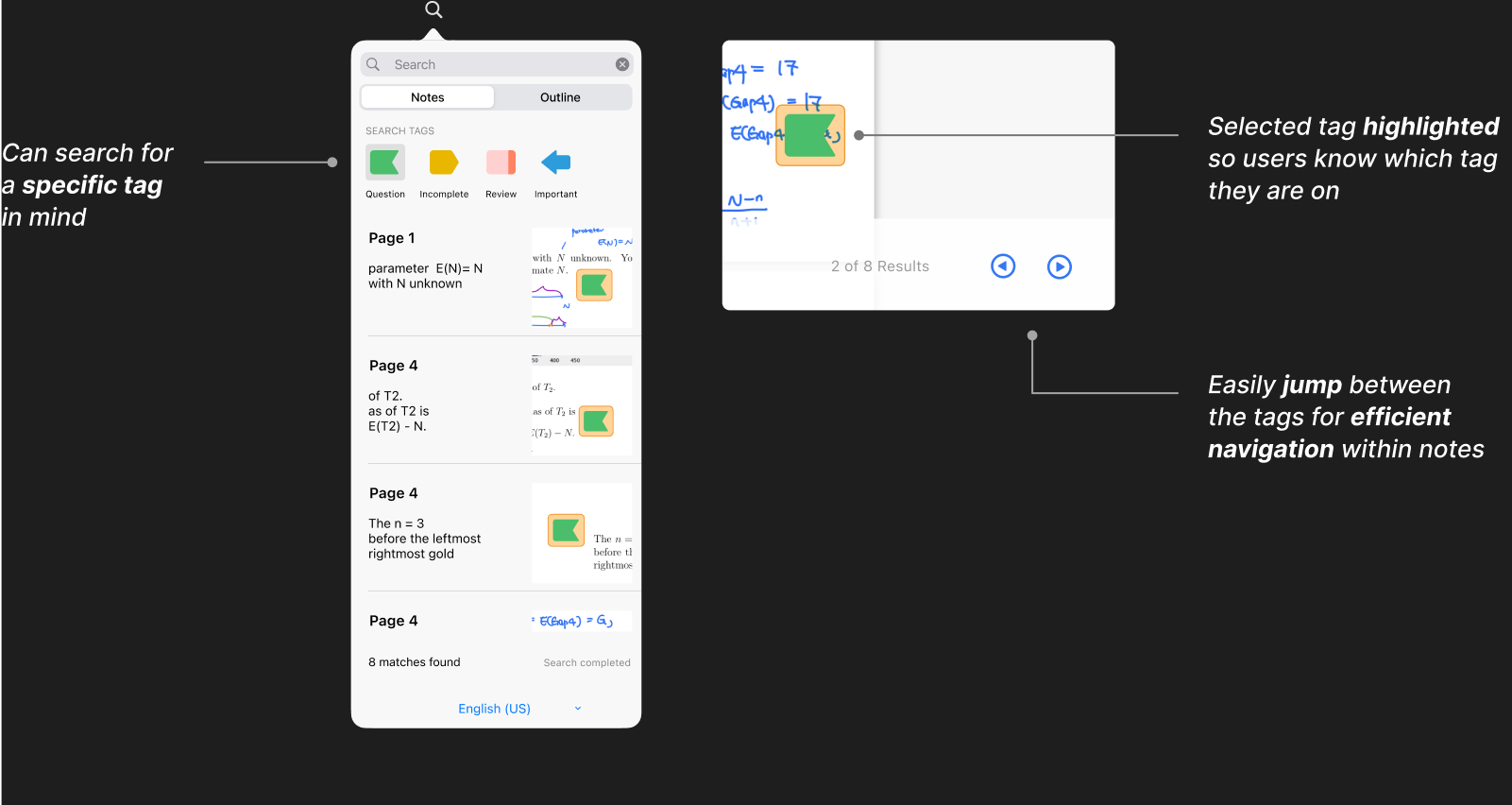
If you come across important information or have questions, tag them. The customizable and expandable tags create visual cues to help you better remember and organize your notes.
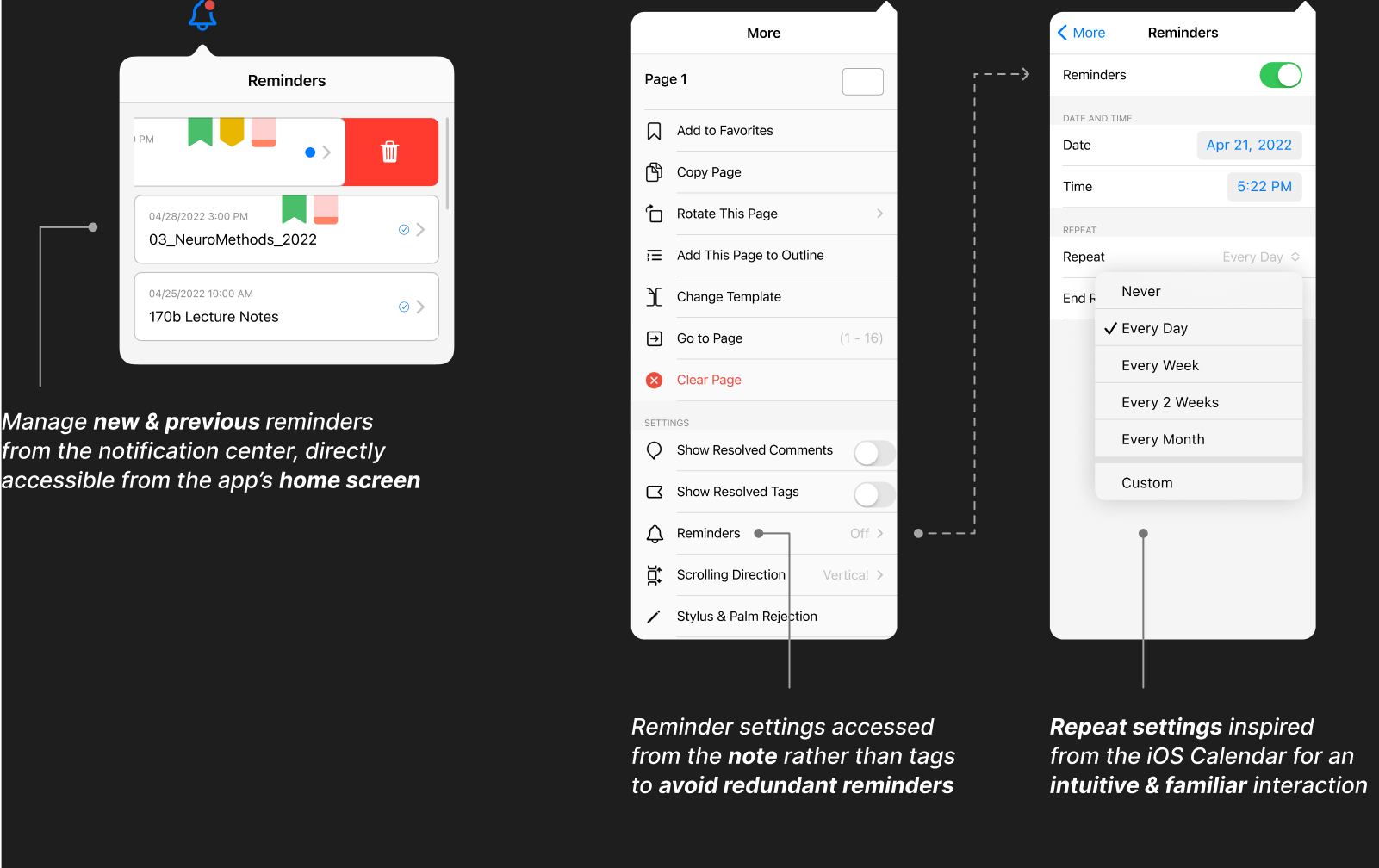
Turn on reminders to receive regular notifications reminding you to review and revise your notes, boosting your confidence in your study routine.

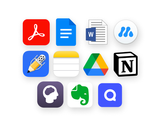
Exploring GoodNotes and its 11 competitors to study different types of note-taking.
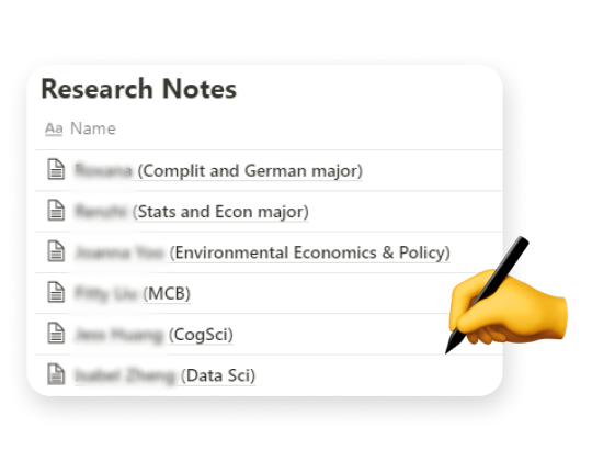
Uncovering 6 students' actual note-taking practices and habits.
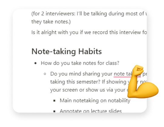
Defining "confidence" from 64 students and hearing how they achieve it from 9.
edit_note Low-confidence students struggled with efficient note-taking.
When faced with dense information—such as a fast-talking professor—low-confidence students found it burdening to keep up with the lecture. Hence, they struggled to prioritize and structure content, getting lost in the process.
“I like to keep my notes organized... but sometimes I get caught up [in the process].”
– Low-confidence student"I understand lecture content by constantly revising & summarizing my notes."
– High-confidence studentchecklist Frequent note-revising & reviewing were correlated with higher confidence.
Revising one's notes requires cognitive engagement, which, in turn, helps the note-taker retain its content[1]. This was consistent with our findings, as higher-confidence students reported to review and revise their notes more often than low-confidence students.
1. Luo, L., Kiewra, K. A., & Samuelson, L. (2016)
When taking notes during lectures, low-confidence students frequently found themselves over-simplifying or falling behind while trying to keep pace with their professors. Thus, due to the haphazard note-taking, students got lost in their own notes when the time came to study for their exams.
Having these in mind, our tool not only needed to guide students while taking their notes, but be helpful during the subsequent reviewing process.
From our Impact x Effort Matrix, we found the ideas with the greatest impact to be interactive note-taking and studying methods such as adding tags or using markdown segmentation in notes, or sending out reminders per study material.
However, I deemed markdown segmentation required high effort to the point where it was infeasible, as it is most suited for typed-platforms such as GitHub and Obsidian, compared to GoodNotes and its focus on hand-written notes. It also has a high-learning curve which can be burdening for the users.
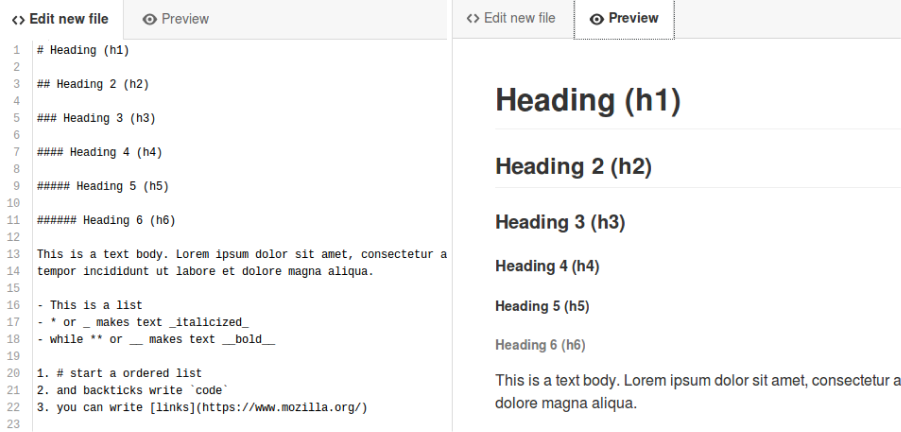
Above: example of GitHub's markdown system—looks very intimidating for starters!
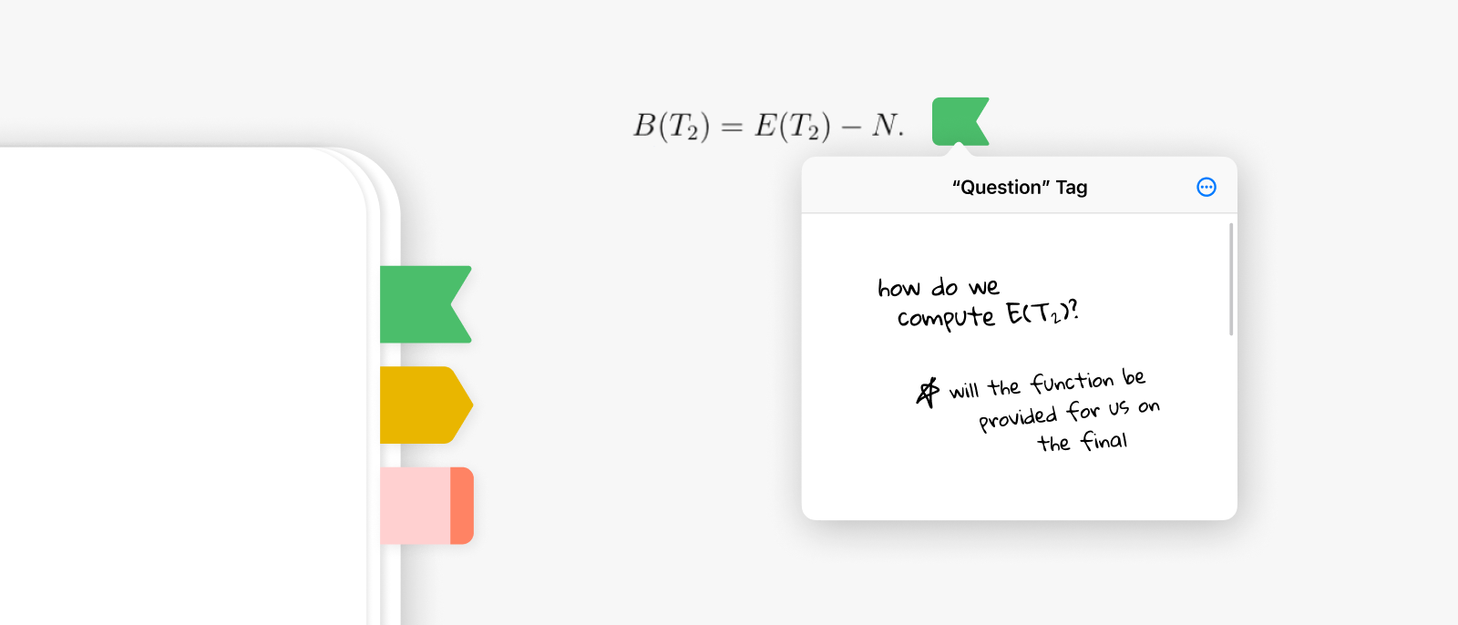
Inspired from paper sticky notes, we wanted the experience of GoodNotes Tags to feel intuitive—like when actually tagging one’s notes with post-its. Combined with Reminders, we imagine GoodNotes to be differentiated from pen-and-paper by showcasing the strengths only digital platforms can have.
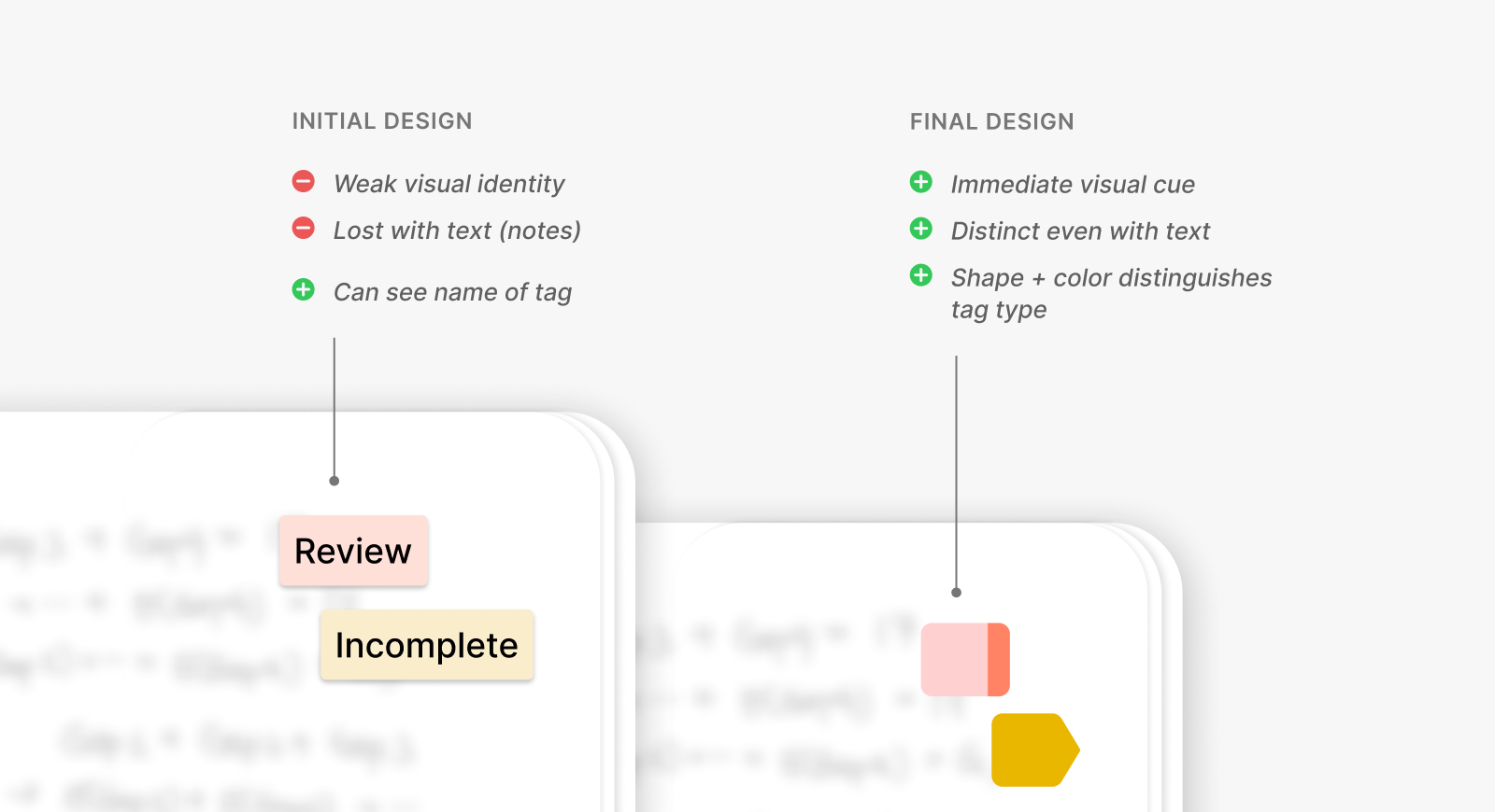
In our initial iteration, we experimented with straightforward designs with tag names explictly embedded within the shape. However, I thought the text on the tags felt overwhelming when paired with the notes, with the design itself lacking a clear visual identity.
Our final design resembles paper sticky notes, implementing an easily distinguishable yet simple appearance for immediate visual cues.
Previously, we placed tags within GoodNotes' toolbar alongside the rest of its features. Yet, during user testing, we realized this was not convenient as users had to repeatedly drag and drop the tags from the toolbar, interrupting their flow of note-taking.

Instead, I for a long-press interaction to insert the tags. This way, students are able to quickly add a tag wherever they are on the screen.
Although the tags would be taken out of the toolbar, both the clients and the team agreed that a long-press pop-up modal remained readily discoverable and rather enhanced the efficiency of the workflow.
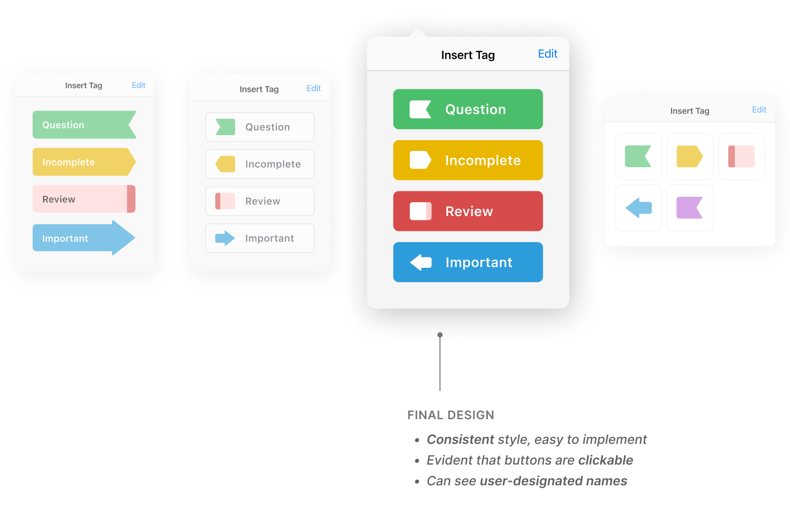
With the updated entry point, we explored many interfaces for the insert tag modal. I ultimately landed on a consistent design for the buttons, where the name, color, and shape of the tags could be shown.
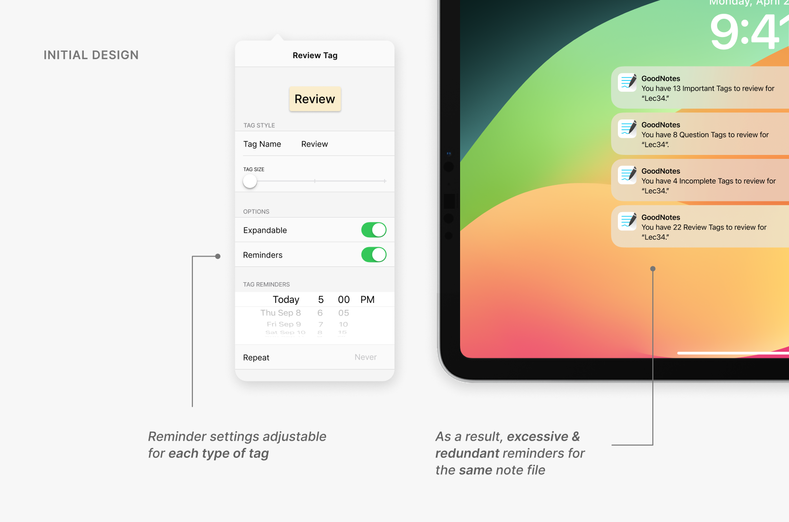
Originally, we integrated Tags and Reminders, imagining a feature where users could activate reminders specifically for a particular type of tag. For example, if a user wished to enable reminders exclusively for the "Question" and "Review" tags within their "Lecture 34" notes, they would only receive notifications for these tags.
However, in the edge case where the user would turn on reminders for all their tags, they would get bombarded with notifications for the same file—which would quickly become annoying.
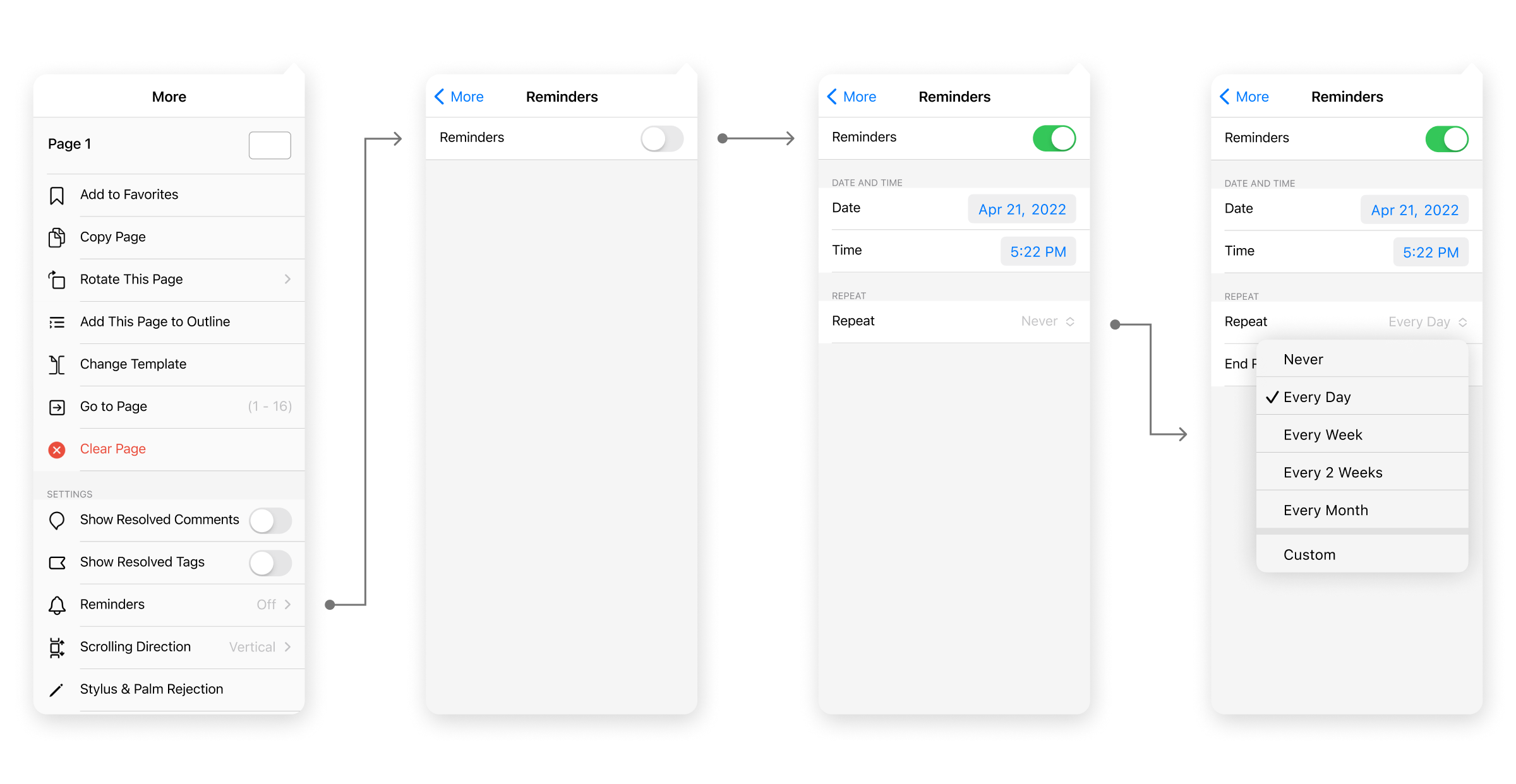
To solve this issue, we ultimately decided to separate the two features—Tags and Reminders—and let the Reminders live under the settings of each file. This way, users can receive a consolidated reminder per each file, instead of being notified by every type of tag.

From forming tactile connections with one's own notes to developing an organized routine to review content, GoodNotes Tags and Reminders guides students across the entire studying process.
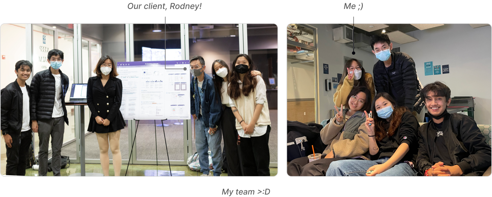
While my role during this semester-long project was to mentor and lead other student designers of Berkeley Innovation, I, in-turn, learned so much from my team and our clients Rodney and Leo!
The culture of GoodNotes focuses heavily on UXR and tying every design decision to insights and user habits—and they weren't hesitant on getting us onboard with their culture. It's important to constantly check the intent of the designs and to make sure they actually address the problem at hand, without creating additional complications. After all, I am designing for the users, not myself.
While GoodNotes is a digital app, it still highly maintains a physical counterpart—note-taking by hand. Thus, we looked into physical designs and daily experiences for inspiration, which led us to the idea of index tabs ("Tags"). This idea, then, would not only be familiar for users but be intuitive to use.
Digital designs don't mean I should strictly look into the digital realm for inspiration; sometimes, the solution lies more intimate to our everyday lives.
